You might have seen the websites that are like magic and help businesses succeed. These websites perform remarkably better and are completely different from other websites.
What are the techniques employed by these websites to achieve such high conversion rates? Let’s unravel the mystery and discover the best practices that these websites adhere to.
A high-converting website balances clear value, user-friendly design and compelling content. It loads quickly, features persuasive calls to action and builds trust with social proof. Regular updates, analytics and SEO maximize effectiveness. Prioritizing security and streamlining the checkout process round out the essentials for turning visitors into customers or leads.
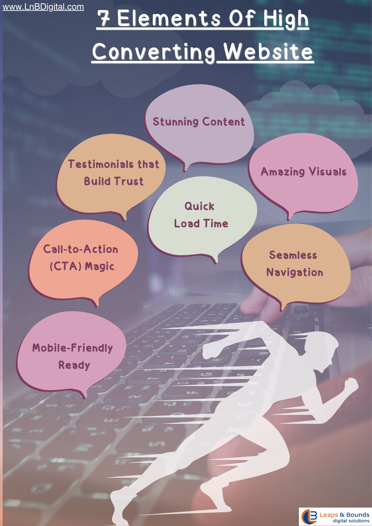
Imagine this: When you arrive on a website, it is as dry as a desert during a heat wave. Yawn! Killer content is therefore paramount for businesses. Your website shouldn't read like a legal document, but rather like an engaging novel. Add some personality, share a tale, and, when appropriate, joke around a bit. Always keep in mind that humor gives your content flavor and helps people remember it.
A website with high conversion rates is like a visual feast. People adore beautiful images and striking graphics. The catch is to not go overboard. Your website should resemble a museum of fine art rather than a messy teen's room. A sense of humor in your visuals can help to lighten the mood and balance is important. Just be careful not to become overly cheesy; nobody likes a website that acts like a stand-up comedian.
Without any assistance, getting lost in a maze would be frustrating. Visitors get that impression when your website's navigation is poor. Make sure your menu is straightforward and simple to comprehend, like a GPS for the internet. It would also be nice if your navigational items had some clever labels. Just keep in mind that simplicity is best.
Nobody has time to wait impatiently for your website to load in the age of instant gratification. Sluggish websites are comparable to snails running against cheetahs. Show a picture of a snail with the caption, "This isn't your website, we promise!" to add humor to the situation. Then, ensure that your website loads as quickly as a squirrel high on caffeine.
Think of testimonials as the digital version of the word-of-mouth recommendations from your grandmother's book club. People tend to trust the opinions of others about you. To make your testimonials more entertaining, use funny quotes or customer anecdotes. Just make sure they're sincere—nobody likes a fibber, even in silly attire.
CTAs direct your visitors to take action, much like the ringmaster at a circus. However, don't use dull "Click here" buttons. Change that by enticing them with expressions like "Join the Party" or "Let's Get This Show on the Road!" Your CTAs can add a playful touch by including humor, which increases clickthrough rates.
Everyone and their grandmother uses their phones to browse the internet these days. In the era of artificial intelligence, your website might as well be a typewriter if it isn't mobile-friendly. Make sure your website is funny and has a beautiful mobile design. Perhaps a message that is appropriate for mobile devices would read, "Our website looks so good on your phone; you might want to marry it!"
In the end, making a website that converts well is similar to making the ideal sandwich. To make it memorable, you need the right ingredients in the right amounts with a little extra flavor. Your website’s high level of engagement and conversion-friendly design will help you to get long term customers.
Quick Links
get in touch
© 2024 Lnb digital solutions. All rights reserved