In today’s internet world, users can visit websites through different sorts of device-based services hence if a site cannot adjust on its own, it is as good as useless. Mobile versions are necessary components of a meaningful web presence. In this paper, an assessment of the importance of responsive design for mobile first focuses on what it means and what the most effective aspects of it will be explained. It is by using these responsive web design services of such companies, who deal with responsive web design, one can make stimulating web pages for clients as well as other users’ needs.
The best way to optimize content for all screens is probably to have contact with a responsive web design company!
Mobile first defines the modern world. Therefore, smartphones and tablets have been considered as the major means of online search. With an ever-increasing number of mobile users, a company must keep up just to stay relevant. When doing mobile-first responsive design for your website, you will be able to visit your site using desktops, computers, tablets, and even smartphones.
UX is important in web design. In other words, a responsive design means easy access to site visitors regardless of the devices they use. Navigation is a feature that makes it easy for customers to interact with what the site contains such as ideas or a product being sold on the website.
Some explanations about why a mobile-first responsive design is imperative in the quick technological world of today!
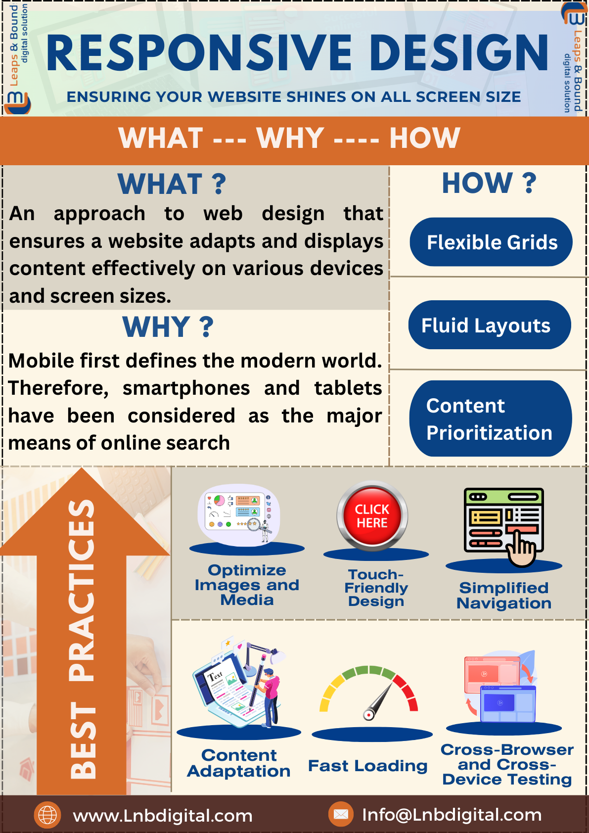
Responsive website design includes flexible grids, fluid layouts, and media queries. Here's a brief overview of how it works:
Responsive design makes use of grid systems for arranging the contents. The grid for content has columns that act as dividers. Columns tend to be responsive to specific screens of a user.
Unlike most other grids, the values of its elements are expressed in percentages and not in pixel sizes. As a result, their width will be expanded or reduced according to the size of the screen. For this reason, they provide such flexibility, and all contents are displayed correctly in various handsets.
Prioritizing content for a mobile-first responsive design. It becomes more important when designing for mobile phones, where the designers think of only the essential content and functional elements for the user. The larger the screen size, the more added features that achieve uniformity of user-friendly characteristics.Don’t have a clue how to do it alone? Engage an experienced responsive web design company!
To excel in mobile responsive design, follow these best practices:
Resize images, and downsize media files to improve page load time. Consider the use of response images that are responsive to different screen sizes and resolutions.
Buttons and all other interactive elements must be large enough for comfortable touch operation. It ensures that such devices are easy for people to use when interacting with them via a touchscreen.
Rearrange them to make them easy to see on a page or simplify them in a navigational menu. The use of collapsible menus or hamburger icons helps save space and still allows people to use the most crucial sections on a mobile device whenever they need them.
Prioritize content for mobile users and apply degressive enhancement on large devices. This should come without anything that would make a small screen crowded and overcrowded.
Ensure that your site loads quickly enough, it's also mobile-ready. The slowness in running of sites causes users to abandon them, thereby elevating bounce rates, and leading to poor Search Engine Optimization (SEO) rankings.
Test compatibility across various browsers; uniform functionality and appearance.
Regularly get user input, and carry out usability testing to identify means of improving the user experience and resolving its issues.
Using responsive web design services will also do this. This will enhance user experience, search engine optimization, and prepare for the new millennium. Moreover, using good practices and implementing some of the responsive website design tactics into your plan will help in giving an impressive online experience to your clients that will be applicable across platforms. Ensure that you have a responsive design and your site will glow on any size of screen delivering unmatched user experience for your visitor.
Quick Links
get in touch
© 2024 Lnb digital solutions. All rights reserved